Maybe we should do that more often?
Hugs Mcgee
Dependent Study Fall 2008


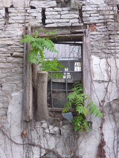
 We were left awe-struck.
  Obviously, this building is really old. But why is it still standing? Or maybe, more importantly, HOW is it still standing? It's such a beautiful, old creature. Was it once a home? A shop? Or something more sinister? Who knows?
 Now, it's returning to the earth from whence it came. We're going to do some investigation and attempt to discover its provenance. We'll keep you posted.
 We've mentioned in prior posts that we're working on designing a co op grocery store/kitchen incubator/artist's studio in Old North St. Louis. Our project is moving along slowly, with many fits and stops. But ultimately, it is moving forward. We're taking this existing building on 13th st and St. Louis ave. It sits on a large lot and has a small community garden funded by a grant from Missouri Foundation for Health. Our main goals with this project are to 1) provide a venue for healthy, good food in the Old North area, 2) create habitable, pleasant space, 3) reuse this old building in an interesting way.

 This is a drawing Hitomi made of the same elevation that takes DJ's ideas further. Here, the blank, windowless walls are cut into to 1) allow light into the space, 2) help with ventilation, and 3) break up the facade, giving it a more human, less monolithic scale. Hitomi proposed the idea of cutting these notches into the wall (the lower half of the drawing) to do just that. We're thinking of covering the walls between these notches with advertisements for the grocery or simply, pictures of veggies and maybe installing benches along these spaces, as well.
 This is a drawing I made that we all helped photoshop. It's of the loading dock/east/west facades. Here, we're exploring rooftop access and how that could work. We're proposing having a staircase that leads to the roof but begins inside the building. We're proposing this for safety reasons (Roofs are dangerous, you cant just have random people climbing up there willy nilly) and because it's kinda cool.
 The bottom rectangle house the grocery (far left), incubator (square-ish thing near the center), bathrooms and an office/storage space (far right). The rectangle above all that stuff is where the artist studios will be (note hitomi's notches along the uppermost/northern wall). The deck is the angled form at the very bottom.